Penumbral Reflections
In 2018, I attended the opening of PAC Studios exhibition Penumbral reflections. The following three poems, entitled Penumbra I, Penumbra II and Penumbra III came out of the experience.

Penumbra I
Consider first architecture as a penumbra;
as an act that casts a deep shadow upon art.
Consider then architecture a disciplinary experiment;
a blurring of simulated and physical.
Consider next the tools of projection;
the grid, the light, the curved surface reflecting.
Consider now the murky relationship
between translation and building.
Consider later a lucent procession,
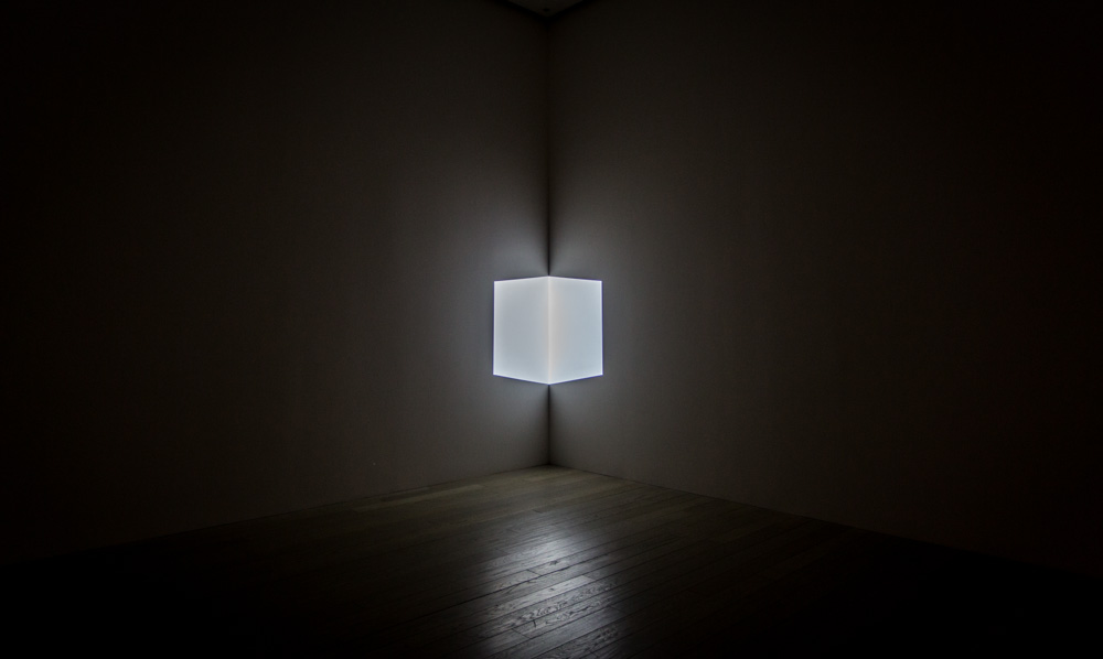
or James Turrells articulate volumes of whiteness.
Consider architecture as the partial shadow that occurs between umbra,
the darkest part of a shadow, and its full illumination.
the murky relationship between translation and building - Robin Evans
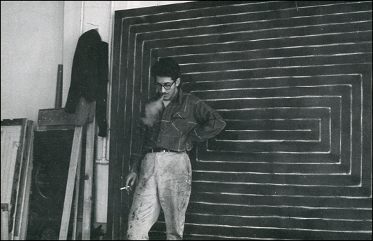
James Turrell, Arfum.
Penumbra II
In it we see:
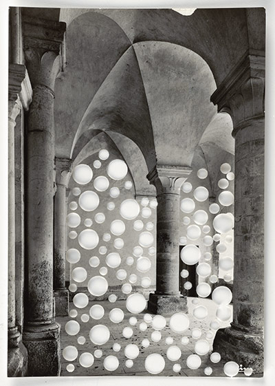
James Turrell's Arfum;
his sketches for it;
the night sky;
the insides of our eyes;
quick drawings we did in charcoal at school;
the magic near-impossibility of a total penumbral lunar eclipse;
that fine passage through the penumbral cone that the moon must make, not touching the umbra.
Penumbra III
In darkness, all the possibilities present themselves and become entangled.
We are immersed.
As lines become planes we to watch ourselves tip into three-dimensionality.
The room levitates.
The horizon shifts.
We are on a plane. We are rendered in continual movement.
This is drawing, you say quietly. This is all drawing.